Why Is the LMS User Experience So Important?

UX impacts EX which impacts ROI. That includes you administrators, too.
Why Is the User Experience So Important When Implementing a Learning Management System?
It’s not uncommon for many organisations to define their expectations around cost and support services when procuring a learning management system. While fundamental factors, the most overlooked, underrated and undervalued consideration when purchasing an LMS is the user experience (UX).
An engaging UX sets the tone for all other functions and features included in an LMS. Good UX means the LMS itself is somewhat of a wallflower in the online learning environment, leaving room for learning itself to be the only thing on users’ minds when they enter the platform.
In this article, we’ll walk you through exactly why the user experience is make-or-break for learning management systems and the UX-friendly features you should look out for in an LMS.
What is the user experience and why is it so important?
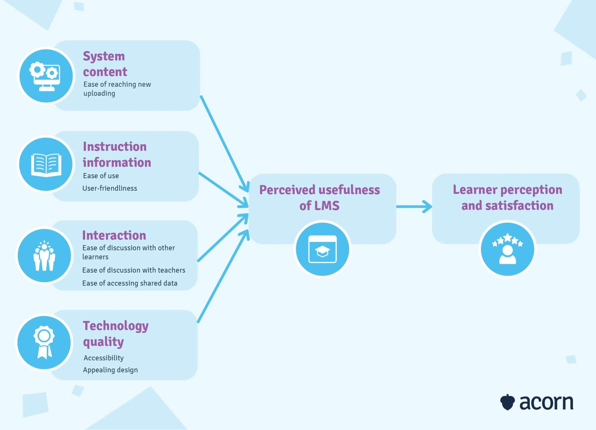
User experience, in its purest form, refers to the various factors that make an LMS effective, easy to use and enjoyable to engage with. Those various factors include:
- Accessibility
- Interface intuitiveness
- Visual design
- Findability.
The reason why we’re even writing this article is because the success of an eLearning initiative hinders, quite literally, on the LMS user experience.
Learners finding it hard to navigate? They won’t engage. Users with disabilities can’t access it? They won’t use it. Admin can’t easily use any of the features promised to them? Well, you get the picture. And if your LMS was intended to automate compliance training, provide clearer data for workforce planning or even just make the delivery of assessments easier, poor UX design will just create learning-related stress, which just turns it into a costly and distractingly time-intensive learning curve.
No, really, why you need to consider UX
Often the purpose for procuring an LMS is to create a culture of continuous learning and development. An LMS is a one-stop repository of all the learning materials a user could ever need—until they perceive it as a hindrance on their learning journey, that is. And it’s not just about learners and their consumption and absorption of training material. Managers, C-Suite and admins all need to see the benefits themselves to be able to act as effective role models.
The makings of a great LMS user experience
Look at Facebook, Instagram, Netflix and YouTube. We engage with each one arguably every day, not least of all because they’re incredibly easy to navigate. An LMS that offers the complete package of brains and beauty enables virtually anyone to use it with little effort.
Pros of UX aside, it’s time to get to the nitty gritty. What are the ingredients that make for a great LMS user experience?
Accessibility
It’s easy to view the process of procuring an LMS through a biased lens. After all, decision makers will likely end up using the system, too. But as workforces diversify—in age, nationality, location—so too should the options provided by an LMS.
Users with disabilities
There are over 1 million people with disabilities in the Australian workforce alone. It’s then crucial to ask suppliers about the features and functionalities they offer that make their LMS accessible to people with disabilities. These are just a few of the features your LMS may need to have or be compatible with:
- Screen readers for the visually impaired, such as Apple VoiceOver and Microsoft Narrator.
- Text alternatives for non-text content and vice versa, such as subtitles or transcriptions for video content.
- Responsive screens for different devices and screen sizes.
- Fully functional navigation via keyboard or mouse.
- Appropriate use of colour, so that the contrast between fonts and backgrounds is accessible to colour-blind users.
Offline access
Even in such a tech-reliant and savvy society, there are still times when internet connectivity is patchy at best and non-existent at worst, such as for organisations or workers in remote areas. It’s important for your LMS to be accessible even without an internet connection so that training pathways aren’t interrupted (particularly those necessary for industry certifications or workforce plans). This is typically achieved through a learning record store (LRS), which collates any learning data and saves it for other uses like reporting.
Multi-language system
Not to be confused with translation, LMS software with multi-language capabilities changes not just the words but the context of the content being adapted. Users have the freedom to choose their language within the system, which then changes the entire interface (all content, databases, notifications, location and date & time settings) to suit their region. Make sure to consider any languages that are read right to left, as well, such as Arabic.
Usability
The art of good UX is in understanding people’s instincts and reflecting that in intuitive design. Most people are used to search functionality and menus being at the top of their screen, so why usurp the natural order of things? If they feel as though a system is too hard to navigate, or the user interface design is so busy it assaults the eyes, or that it’s simply not worth the pain of learning how to use it, they’ll check out. This is commonly referred to as loss aversion, wherein avoiding any perceived losses (e.g. the hassle of learning a new system) is equally as or more pertinent than anything a user may gain from the end experience.
Don’t confuse the learning aspect of an LMS with a learning curve for the system. The greatest gift a learning tool can give is the freedom to navigate the site without disruption or impediment.

Brand identity
It’s essential to create an emotional connection between your brand and employees as you would with customers. Employees want somewhere familiar to come home to; a UI with your brand identity, logo, colours and voice will ensure there’s no culture shock when they log into the system.
Say you use an LMS for eCommerce. You can further promote your brand through rewards and certificates once training is completed. These can be shareable on social media platforms with a social collaboration integration, creating a positive connection between the end user, your LMS and your brand. Or perhaps you take care to create content that is rooted in your ethos or branding. If you then upload that into a generic or unbranded LMS, it creates a disconnect in users’ minds and inadvertently communicates the LMS is more of an extraneous limb than a true part of your organisation.
Gamification
Many LMSs follow a well-trodden path of traditional learning. This leads to a rather methodical learning process utilising the “rinse and repeat” technique where:
- Learner fails a module
- The system takes them back to the start to revise theory
- Learner repeats the exact same module, or one with reframed questions.
But while there’s some interaction, there’s no real engagement, feedback or motivation.
Gamification uses game mechanics in non-game scenarios to engage, motivate and change behaviours. These mechanics include points, badges, challenges, leader boards and incentives that make the experience holistically learner-centric. Short-term rewards, like badges, build small learning habits (such as returning to the system weekly to beat a previous personal best) that foster long-term engagement. An immediate feedback loop also means there’s no fear of failure, since gamification shows learners what will cause them to progress (or ‘win or fail’), thus creating more creative problem-solving mindsets.
Want to see Acorn PLMS’s UX in action?
Hit the book a free demo button here, take seconds to fill in your details, and find out how Acorn can help you succeed.
Why the LMS user experience matters for all users
Here’s the gist of it: the term ‘user’ does not refer solely to learners. Other players in the LMS UX game include admin, facilitators, external instructors and any other role you can plug into your LMS. Why should a system be easy for a learner to access but a nightmare for admin, who actually facilitate the learning, content and analysis?
Learners
The learner experience has a significant influence on knowledge retention and real-world application. If they find a UI complicated, requiring training sessions to simply understand, using the system itself becomes the learning activity. And that’s a tedious, multi-step process: they need to learn where and how to extract the information they need and circumnavigate glitches from an unintuitive dashboard.

Why UX really matters for learners
Instead of engaging with the key learning takeaways literally designed for them, their ability to absorb and utilise the information they do acquire could be diluted by poor UX. This leads to a negative connotation associated with LMS platforms, which might result in them failing to apply it whatsoever.
Admins & facilitators
Whether it’s external or internal facilitators, HR personnel, tutors or administrative staff, the people who become system admins need a system that is user-friendly because:
- They’re the ones making sure learning materials and pathways are available to the typical end user, the learner.
- They need to be able to quickly upload content to ensure learners can have their learning on tap, as well as modify existing online materials to keep them up to date.
- They need to tailor advanced reporting analytics swiftly to their unique situations.
- They shouldn’t worry about data migration between the LMS and other existing systems like payroll which isn’t functioning as it should.
Why UX really matters for admins
If the user interface is a bother to access, navigate or simply overly complicated to understand, they have to contend with issues that distract them from the educational process and creating high-quality learning experiences for other users.
Your organisation’s bottom line
A favourable (or even excellent) user experience with an LMS directly translates to better return on investment (ROI).
Intuitive UX is just an indicator of effective online training and a streamlined learning and development process. Where there’s high satisfaction, there’s also smarter resource allocation in future since there’s no need to implement a new system, spend time and money readjusting an average initiative, and you’re actually aware of the areas that need that investment.
Why UX really matters for your ROI
The UX matters even more so here because it sets gears in motion, instead of putting a wrench in the works. It sets the foundation for a culture of continual learning, and allows HR and talent management teams to start to implement or better use workforce planning strategies.
Key takeaways
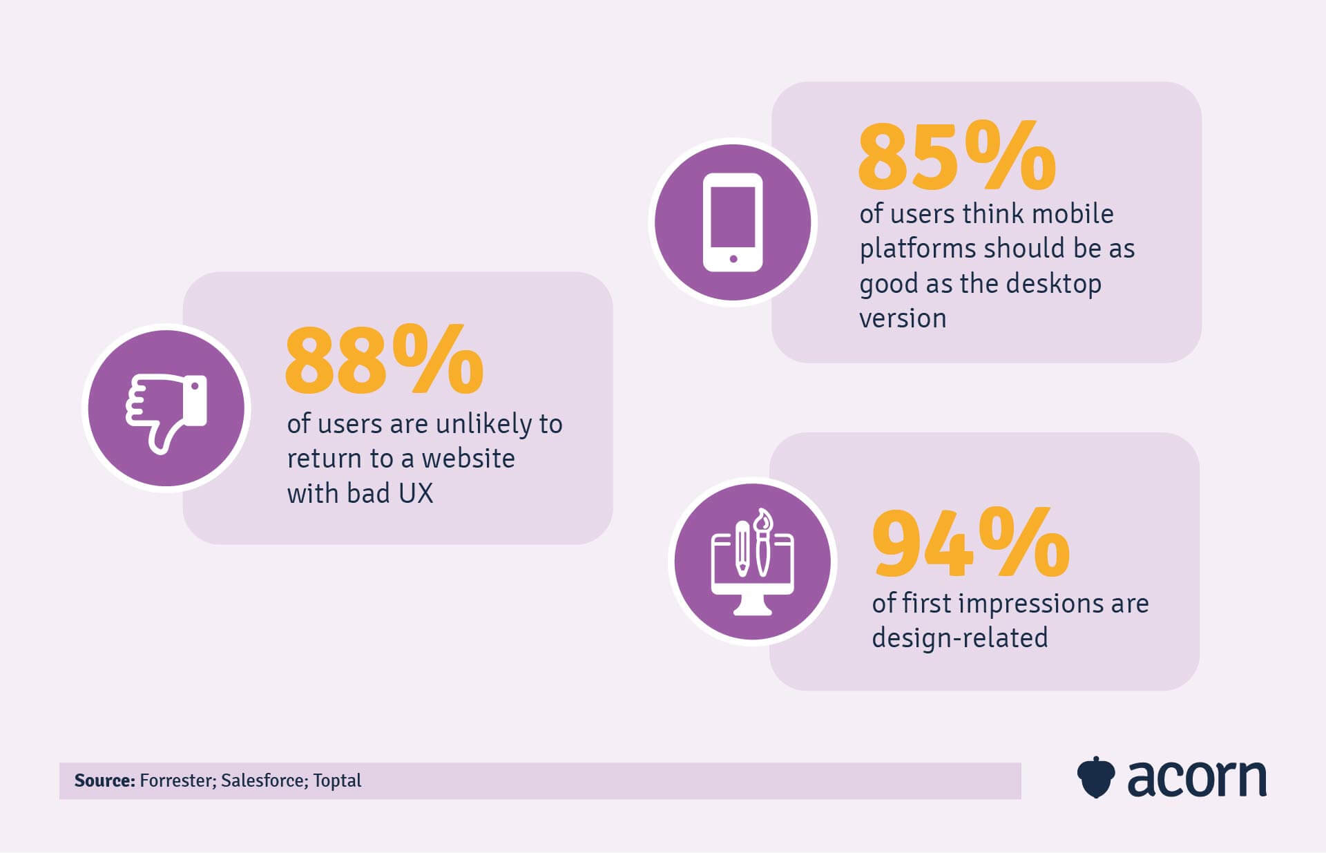
The connection between learner engagement and the user experience cannot be understated, nor can the knock-on effects of either of those being lacklustre. The poorer the user experience, the less likely learners are to return to training, which means mandatory (i.e. industry compliance) and strategic programs (like capability building) will flounder.
And that means that any business objectives reliant on those training programs will suffer. So, ultimately, you should think about your organisational goals as much as training outcomes when it comes to the LMS user experience, let alone your learning platform. The two are inextricably linked, and a little forethought about how you can keep learners engaged in training with a meaningful experience will pay dividends down the line.